
So, what exactly is student journey mapping?
Think of it as a detailed, visual story of every single interaction a student has with your institution. It starts from their very first Google search about your programs and follows them all the way through to graduation day and even into their life as an alum.
It’s about seeing your school through your students' eyes. This process reveals the real-world experiences that either set them up for success or, all too often, lead them to walk away.
Why Student Journey Mapping Is Essential Today
Let's be blunt: understanding the student experience isn't just a nice-to-have. It’s a survival strategy for any modern college or university. In today's competitive landscape, you simply can't afford to make assumptions about what students need or where they're getting stuck.
Student journey mapping pulls you out of your internal bubble and gives you a clear, evidence-based view of what’s really happening. It allows you to trace every step, every touchpoint, and every emotion a student feels along the way.
More importantly, it uncovers the frustrating roadblocks and hidden opportunities that siloed internal teams—operating in their own worlds—almost always miss.
An Overview of the Student Journey Phases
To get started, it helps to have a high-level framework of the student lifecycle. This isn't a rigid path but a general guide to the distinct stages students navigate. We'll use this structure to build our detailed map. This table breaks down the typical stages, their primary goals from the student's perspective, and the key touchpoints where your institution interacts with them.
| Journey Phase | Primary Student Goal | Key Institutional Touchpoints |
|---|---|---|
| Awareness & Discovery | "Is this the right school for me?" | Website, social media, college fairs, online ads, high school counselors |
| Application & Admission | "Can I get in and how do I apply?" | Application portal, admissions officers, campus tours, financial aid website |
| Onboarding & Enrollment | "I'm in! Now what?" | Acceptance letters, orientation, registration systems, academic advisors |
| Academic Engagement | "How do I succeed in my classes?" | Faculty, learning management system (LMS), library, tutoring centers |
| Support & Community | "Where do I belong?" | Student life, clubs, housing, wellness centers, career services |
| Graduation & Beyond | "What's next for my career and life?" | Commencement, alumni association, career counseling, networking events |
Think of these phases as the chapters in your student's story. Our job is to fill in the details of what happens in each one.
Uncovering the Hidden Student Experience
When admissions, financial aid, and academic departments don’t talk to each other, the student doesn't see separate offices. They see one confusing, disjointed institution. They don't care about your org chart; they just know they can't get answers about their aid package while an application deadline is screaming at them.
A journey map's real power is its ability to expose this "hidden curriculum"—all the unspoken rules, baffling processes, and bureaucratic hoops that can completely overwhelm even the brightest, most motivated students.
For example, a map might show that prospective students are fired up and engaged right until they land on your financial aid information page. Suddenly, you see a massive drop-off in applications. This isn't just a data point; it's a story about anxiety and confusion. Without the map, you might just assume a lack of interest, when the real culprit is a terribly designed webpage.
From Insights to Institutional Advantage
This isn't just an academic exercise. An effective student journey map is a practical tool that drives real, measurable results for your most important institutional goals.
- Improved Enrollment: By finding and fixing the pain points in your admissions process, you can stop losing applicants in the pipeline and convert more of those initial inquiries into enrolled students.
- Boosted Student Retention: Mapping shines a light on the exact moments where students feel lost or unsupported. This allows you to create timely interventions that keep them on track to graduate. Making the student experience easier is a proven factor in reducing attrition.
- Fostering Genuine Loyalty: When students feel seen, understood, and supported at every stage, they don't just graduate. They become your most passionate alumni and lifelong advocates.
Ultimately, student journey mapping forces a critical shift in focus—from your internal processes to student-centered outcomes. It delivers the strategic clarity you need to put resources where they matter most, streamline how you operate, and build an environment where every single student has a clear path to success.
Gathering Your Data and Building Personas
A great map is built on great data, not guesswork. The whole point of student journey mapping is to get out of your own head—and your internal meetings—and ground your strategy in the actual, lived experiences of your students. This is the foundational research that makes your map a reliable, strategic tool instead of just a pretty diagram. The most effective approach always blends two kinds of data: quantitative and qualitative. Think of them as the "what" and the "why" of student behavior.
- Quantitative Data: This is your hard data, the numbers that show what students are doing. You'll find it in your CRM, website analytics, and student information systems (SIS).
- Qualitative Data: This is the human story, the context that reveals why they're doing it. This comes straight from students through interviews, surveys, and focus groups.
Without the numbers, your map won't have scale or statistical proof. But without the stories, it will lack empathy and the rich, human details that point you toward real solutions.
Tapping into Your Quantitative Data Sources
First, start with the data you already have. You’re probably sitting on a goldmine of insights that can expose critical patterns and drop-off points in the journey. The real trick is connecting all those different sources to see the whole picture. To pull this off, using data analytics for education is essential for uncovering deep insights into student behaviors and patterns. Here’s where to start digging:
- Website Analytics: Look at the user flow on your most important pages—admissions, financial aid, and program details. Where do prospective students hang out? More importantly, where are they leaving your site?
- CRM Data: Go through your communication logs. What questions are the admissions team answering over and over? What’s the average response time for an inquiry?
- Application Funnel Data: Pinpoint exactly where applicants are dropping out. Is it the personal essay? The payment page? The transcript submission? A 15% drop-off at one specific stage is a huge red flag telling you something is broken.
- LMS Engagement Metrics: For your current students, check out how they interact with their courses. Low login rates or a pattern of missed deadlines can be the first sign a student is disengaging.
Gathering Rich Qualitative Insights
Numbers only tell you half the story. They can't capture emotion. To truly understand a student's anxieties, frustrations, and moments of delight, you have to talk to them. This is how you find the pain points that analytics alone will never explain.
A journey map built only on analytics is just a flowchart. A map built with student stories is a tool for building empathy and driving meaningful change. It’s the difference between knowing that students drop off and knowing why they felt too overwhelmed to continue.
According to a recent guide, powerful maps reflect actual student challenges by using real data from surveys, applications, and learning management systems. Institutions that set clear goals, like improving retention, and gather diverse perspectives from both students and staff are the ones that uncover those hidden obstacles. You can find more insights about this student-centric approach on goedmo.com. Your goal here is candid feedback. You need to create a safe space for students to be honest, which means using a mix of methods.
- One-on-One Interviews: These are perfect for deep dives. Ask open-ended questions like, "Walk me through the day you decided to apply. What was that like?"
- Focus Groups: Great for spotting common themes among a specific group, like transfer students or first-generation applicants.
- Surveys with Open-Ended Questions: Use surveys for scale, but always include free-text boxes so students can explain their ratings. A "3 out of 5" score is useless without the "why."
- Staff Feedback: Don’t forget your frontline staff. Admissions counselors, academic advisors, and financial aid officers hear student frustrations every single day. They have invaluable, on-the-ground insights.
From Data to Actionable Student Personas
Once you have all this research, the next step is to distill it into student personas. These aren’t just generic profiles; they are research-backed archetypes that represent your key student segments. They’re how you turn raw data into relatable characters your whole team can understand and rally around.
A strong persona goes way beyond demographics. It should define their goals, motivations, communication preferences, and—most importantly—their biggest pain points.
For example, you might create:
- "The Undecided Local Applicant" (Maria, 18): Lives 20 miles from campus, first in her family to consider college.
- Goal: Find a supportive school close to home.
- Anxiety: The financial aid process is overwhelming, and she’s afraid to ask "dumb questions."
- Preference: Prefers text reminders over emails, which get buried.
- "The Ambitious International Scholar" (Chen, 22): Applying from overseas for a competitive master's program.
- Goal: Make sure his credentials and visa process are handled smoothly.
- Pain Point: Confusing instructions and slow email responses from the international student office.
- Preference: Needs clear, step-by-step instructions and a single point of contact.
When you build a journey map for "Maria" or "Chen," you’re no longer solving a vague, hypothetical problem. You're designing a better, more human experience for a student you truly understand. This is the foundation for making decisions that actually move the needle.
How to Build a Powerful Journey Map
You've done the research and brought your personas to life. Now it's time for the really fun part: building the student journey map itself. This isn't about just plotting data points on a spreadsheet. Think of it as telling a visual story—one that builds real empathy and, most importantly, shows you exactly where you can make a difference.
A great map turns all that abstract data into a clear, compelling narrative of a student's experience with your institution.
To start, you need to understand the basic building blocks. These are the layers that give your map structure and meaning.
- Stages: These are the big-picture phases of the student lifecycle. Think Application & Admission, Onboarding, or even First Semester.
- Actions: What is the student actually doing at each stage? This covers everything from clicking a link on your website to attending orientation.
- Touchpoints: Where do these actions happen? This could be your application portal, a phone call with an admissions officer, or a campus tour.
- Thoughts & Questions: Get inside their head. What are they thinking? "Am I filling this out right?" "How will I ever afford this?" "Why haven't I heard back yet?"
- Emotions & Pain Points: This is the emotional heartbeat of the map. It tracks the highs and lows. Are they feeling excited, anxious, confused, or supported?
By methodically documenting these elements for one of your key personas, you start to see where the student experience shines and, more critically, where it falls apart.
Bringing the Journey to Life with a Persona
Let's walk through a critical part of the process with one of our personas: "Maria, the Undecided Local Applicant." We'll follow her through the application stage to see how mapping each interaction pinpoints the moments that can make or break her decision.
Maria’s journey starts with a jolt of excitement. She discovers a program she loves on your website and dives into the application. The first few steps are smooth sailing, and her emotional state is high. She feels confident, optimistic.
Then she hits a wall: the financial aid section. The language is dense, packed with acronyms she’s never seen before. Her initial excitement fizzles into anxiety. This is a classic moment of truth—a critical fork in the road where her experience will either strengthen her commitment or send her running.
This is where a visual representation becomes so powerful. You can literally see the path a student takes.
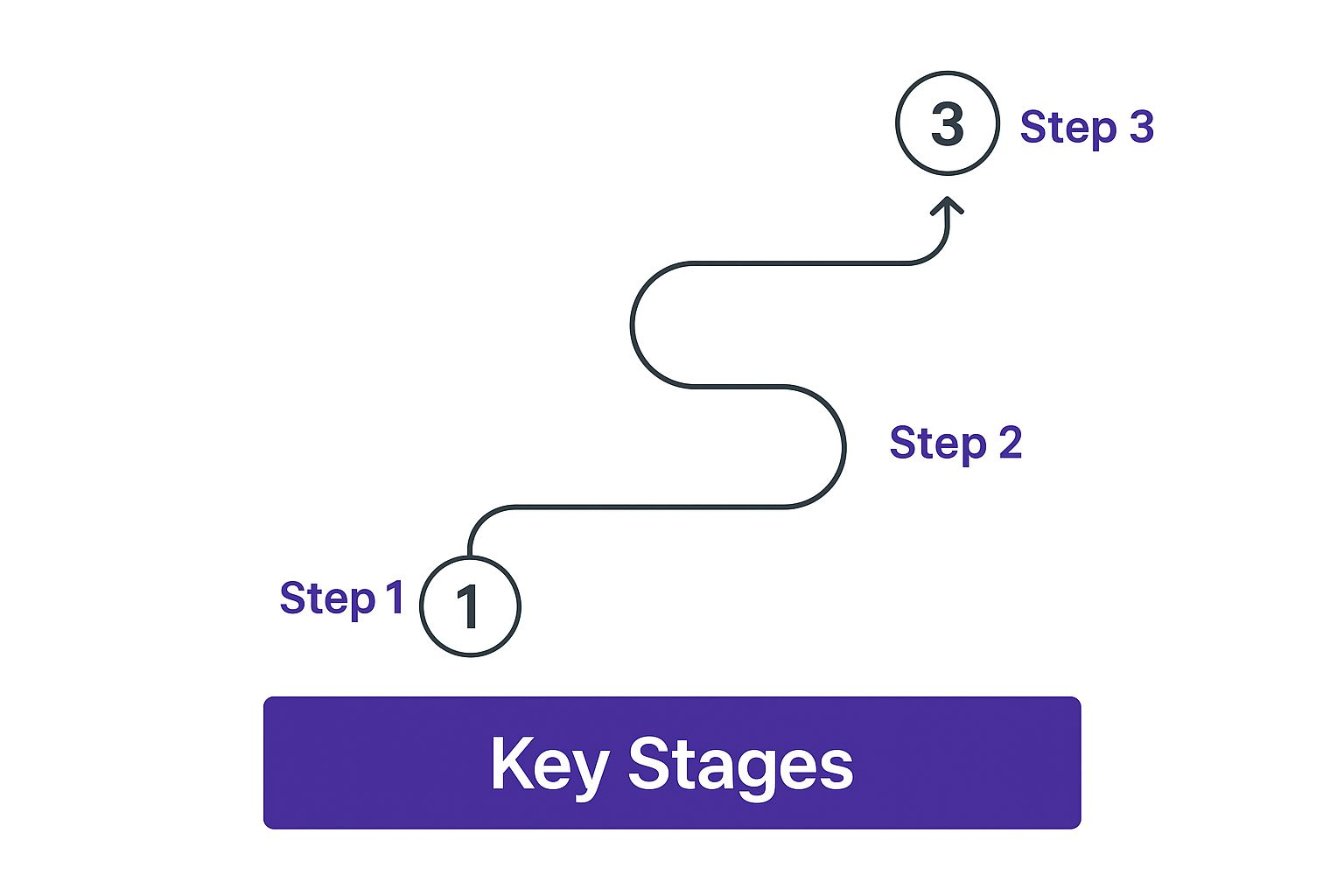
Each point on this path is a touchpoint where a student's feelings and next steps can shift dramatically. It underscores just how vital a smooth, supportive experience is at every single step.
Documenting the Emotional Highs and Lows
Tracking Maria's emotional journey is just as important as tracking her clicks. A simple line graph that rises and falls with each interaction can be incredibly revealing.
- The High: Maria gets a personalized email from an admissions counselor inviting her to a virtual Q&A. She feels seen and supported.
- The Low: She tries to use the financial aid calculator, but it crashes. Twice. Her anxiety spikes, and she seriously considers giving up.
- The Rebound: She attends the Q&A, and a friendly staff member clearly answers her specific questions. Her confidence bounces back.
- The Peak: The acceptance email lands in her inbox. This is the ultimate emotional high point of the entire application journey.
A journey map without the emotional layer is incomplete. It tells you what happened, but not how it felt. Capturing these feelings is what allows you to move from simply fixing broken processes to designing genuinely positive and memorable student experiences.
This emotional rollercoaster shines a bright light on your biggest opportunities. The low points are your immediate to-do list for improvements. The high points are the strengths you need to double down on.
From Individual Stories to Institutional Insights
Of course, you start with one persona, but the goal is to see if these experiences hold true for a wider group. This is where bigger projects can provide incredible perspective.
For example, one Australian university launched a massive student journey mapping initiative. They brought together over 300 students, staff, and partners to overhaul their entire student experience from start to finish.
By systematically mapping touchpoints, they uncovered concrete pain points and identified clear ways to improve their digital services. One of their biggest takeaways? The immense value of including a broad group of stakeholders. It ensures the final map is both realistic and actionable. You can read more about this detailed higher education case study at UXPressia.com.
The final step is creating a compelling visual. Whether you use a fancy digital tool or a simple whiteboard doesn't matter. What matters is that the map is easily understood by everyone, from department heads to frontline staff. Your goal is to create a powerful artifact that tells a clear story, rallying your entire institution around a shared understanding of the student experience.
Navigating Common Mapping Obstacles
Creating a student journey map is a powerful step, but let's be realistic—the path from idea to a living, breathing tool isn't always a straight line. You're going to hit some bumps. The good news is that these hurdles are almost always predictable, and if you see them coming, you can navigate right around them.
So, what's the most significant challenge you'll face? It’s not a lack of data or a shortage of great ideas. The problem is almost always internal.
It’s data silos.
When admissions, financial aid, academic advising, and student services all operate on separate systems and rarely talk to each other, it's impossible to see the whole student. Each department ends up holding one piece of the puzzle, leading to a choppy and often frustrating experience for the very people you're trying to help.
The Challenge of Fragmented Data
Fragmented data creates dangerous blind spots. It's a massive challenge in student journey mapping because siloed systems prevent you from getting a single, unified view of how a student interacts with your institution. As one analysis on how siloed data impacts the student experience from Element451.com points out, this dysfunction leads to real-world consequences. Think delayed application confirmations or slow follow-ups on inquiries, which kill engagement and send applicants straight to your competitors.
This is way more than just an inconvenience; it actively undermines your most important goals. You can't support a student you can't fully see.
Here are a few concrete ways to start breaking down those walls:
- Champion a Centralized CRM: This is about creating a single source of truth. Advocate for one system where all student interaction data lives. This means that when a student calls, any staff member can see their entire history, from their application status to a recent advising appointment.
- Form a Cross-Departmental Task Force: Pull together a dedicated "student experience team" with people from key departments. Their one and only mission? To review the journey map, share insights from their unique vantage points, and collaborate on real solutions.
- Start with a Shared Project: Don’t try to boil the ocean. Pick one critical journey to start—like the onboarding process for first-year students. Get every relevant department to collaborate on mapping and improving just that one area. A small, focused win builds the momentum you need for bigger changes down the road.
The goal isn’t just to share data; it's to create a shared sense of ownership over the student’s success. When your financial aid team understands the anxieties admissions is seeing, they can work together to create clearer, more supportive communications.
Securing Buy-In from Skeptical Stakeholders
Another classic roadblock is getting buy-in, especially from leadership or departments that are resistant to change. They might wave off journey mapping as a "soft" initiative or just another time-consuming project without a clear return on investment.
Your job is to translate your map's findings into the language they understand: results. Don't just present a list of pain points. Connect them directly to core institutional goals.
For example, instead of saying, "Our financial aid page is confusing," try framing it this way:
"Our journey map shows a 35% applicant drop-off right on the financial aid information page. Based on our average tuition, fixing the three biggest points of confusion here could potentially recover $250,000 in revenue per admissions cycle."
See the difference? This approach reframes the conversation from fixing a student complaint to capturing a significant revenue opportunity. It turns skepticism into active support.
Keeping the Momentum Going
Finally, a journey map is not a "one-and-done" project you can file away. It's a living document that needs ongoing attention to stay useful.
- Assign Ownership: Every single pain point and opportunity you identify on the map needs a clear owner—a person or a department who is responsible for developing and implementing a solution. No ambiguity.
- Set Measurable KPIs: For each initiative, define what success actually looks like. Is it reducing call volume to the help desk by 20%? Or maybe it's increasing FAFSA completion rates by 15%? Get specific.
- Schedule Regular Reviews: Revisit your map quarterly or bi-annually. Are the old pain points resolved? Have new ones popped up? This regular check-in keeps the map relevant and ensures your institution is always improving.
These proactive efforts are the foundation for building effective student success programs that get ahead of issues before they lead to attrition. By anticipating these common mapping obstacles, you can turn potential roadblocks into strategic advantages and make sure all your hard work translates into a genuinely better experience for your students.
Turning Insights Into Actionable Strategies

Let's be honest. A student journey map is just a pretty document until you do something with it. The real work—and the real payoff—starts when you take what you've learned and turn it into real, tangible improvements for your students.
You’ve done the hard part of mapping the emotional highs and lows, identifying the frustrating bottlenecks, and finding those surprising moments of delight. Now it’s time to build a smart, prioritized plan that drives meaningful change across your institution.
Prioritizing Your Opportunities
Your journey map probably uncovered a ton of opportunities, from small website fixes to massive process overhauls. If you try to tackle everything at once, you'll just burn out your team and get nowhere. You need a system. A simple but powerful way to prioritize is to plot each pain point on a matrix based on two critical factors:
- Student Impact: How much does this issue really affect a student's experience, progress, or decision to stay?
- Institutional Effort: How much time, money, and staff power will it take to actually fix it?
This immediately helps you spot the strategic wins. The sweet spot is always the high-impact, low-effort tasks. These are your quick wins, the perfect way to build momentum and show skeptical colleagues that this whole journey mapping thing actually works. Think about it: rewriting a single confusing paragraph on your financial aid page is a low-effort task. But for a student, that clarity can have a massive impact, easing their anxiety and keeping them on track. That’s a perfect place to start.
From Pain Points to Practical Solutions
With your priorities straight, it's time for focused, creative problem-solving. This isn’t about just throwing ideas at a whiteboard. It’s about creating targeted fixes for the specific problems your map brought to light.
Let's go back to our persona, "Maria." Your map showed that she—along with a significant number of other prospects—bails on the application right when she hits the financial aid section. Her emotional journey nosedives from excitement to pure anxiety.
So, what are the fixes?
- Simple Video Tutorials: Instead of dense text, create a short, friendly video walking students through the FAFSA or your own aid forms.
- Proactive Chatbot Support: Program a chatbot to pop up on that page and ask, "Stuck on financial aid? I can help!"
- A Clearer Web Page: Break up that intimidating wall of text. Use clear headings, an FAQ, and a glossary of common financial aid terms.
- Live Q&A Sessions: Host virtual sessions where students and parents can get their questions answered by a real person from your financial aid office.
The key is to match the solution to the problem. The map shows you students feel overwhelmed and alone. Your best solutions will offer clarity, guidance, and a human touch right at that critical moment.
Understanding the why behind student behavior is everything. When students feel overwhelmed, their motivation tanks, leading to inaction. For a deeper dive, it’s worth exploring the core principles of how to motivate students to ensure your strategies don't just fix a broken process but also rebuild their confidence.
Assigning Ownership and Measuring Success
An idea without an owner is just a wish. For every solution you move forward with, someone has to be responsible for seeing it through. Without that clear accountability, even the best ideas will die on the vine. A simple chart can keep everyone on track and focused on results:
| Initiative | Owner | Key Performance Indicator (KPI) | Success Metric |
|---|---|---|---|
| Financial Aid Video | Marketing & Financial Aid | FAFSA Completion Rate | Increase rate by 15% for first-gen students |
| Proactive Chatbot | Admissions & IT | Page Abandonment Rate | Decrease bounce rate on the page by 25% |
| Live Q&A Sessions | Financial Aid Office | Session Attendance & Surveys | Achieve an 85% satisfaction score from attendees |
This isn't just project management. It's about building a culture of data-driven, continuous improvement. By setting clear, measurable KPIs, you turn student journey mapping from a one-off project into an ongoing strategic engine. You’ll be able to prove exactly how your work is reducing friction, boosting engagement, and directly supporting your institution's enrollment and retention goals. That's how you prove the ROI and make a powerful case for investing even more in the student experience.
A Few Common Questions About Student Journey Mapping
As you get ready to dive into student journey mapping, a few last-minute questions usually pop up. It’s completely normal. This process is as much an art as it is a science, so let's walk through some of the common hurdles and uncertainties we see all the time. Getting these things straight from the beginning will give your team—and your stakeholders—the confidence to move forward.
How Often Should We Update Our Maps?
Think of your journey map as a living, breathing document, not a "one and done" project that you file away and forget. The student experience is always in flux, shaped by everything from new technology and evolving expectations to your own internal process changes.
A good rule of thumb is to give your maps a major review and refresh annually.
That said, you’ll also want to pull them out any time a big change happens. This could be things like:
- Rolling out a new student information system (SIS) or CRM.
- A major overhaul of your admissions or financial aid process.
- Spotting a new, significant trend in student demographics or behavior.
Keeping your maps current ensures they stay relevant and reliable for making smart, strategic decisions. Otherwise, you’re just working off an old snapshot of the past.
Can Small Institutions Actually Do This?
Absolutely. You don't need a huge budget or a dedicated team of UX researchers to create a powerful student journey map. What you do need is a genuine commitment to listening to your students and getting different departments to talk to each other.
If you’re just starting, start small. Instead of trying to map the entire student lifecycle, pick one critical journey where you know there are pain points. Maybe it’s the application process for transfer students or the onboarding for a specific graduate program.
You can use simple, accessible tools—a whiteboard, a shared Google Doc, or even a basic spreadsheet will work just fine.
The real power of student journey mapping comes from the insights you uncover, not the fancy software you use to create it. A simple map built on honest student feedback is far more valuable than a polished diagram based on internal guesswork.
What’s the Difference Between a Journey Map and a Persona?
This is a really common point of confusion, but the distinction is pretty straightforward—and important. They're two sides of the same coin, and you really need both to make the process work.
- A student persona is the "who." It’s a fictional character, backed by real research, that represents a key segment of your student population (like "The First-Generation Scholar" or "The Returning Adult Learner"). It captures their goals, motivations, and what keeps them up at night.
- A student journey map is the "what they do and how they feel." It’s the visual story of that persona’s interactions with your institution over time. It tracks their actions, thoughts, and emotions as they move through different touchpoints.
Basically, you build a journey map for a specific persona. The persona gives you the empathy, and the map tells the story of their experience. This is why effective mapping is a cornerstone of so many modern student retention strategies—it shows you exactly where and why students might be hitting a wall.
At Motimatic, we specialize in turning these insights into action. By understanding the student journey, we help institutions deliver timely, motivating messages that guide students past common roadblocks and toward success. Discover how our platform can enhance your student outreach.
See it on your own listOne list, one goal, and a randomized holdout to show the lift. Start a pilot